Client
BRIUT
Service
Brand Identity, packaging
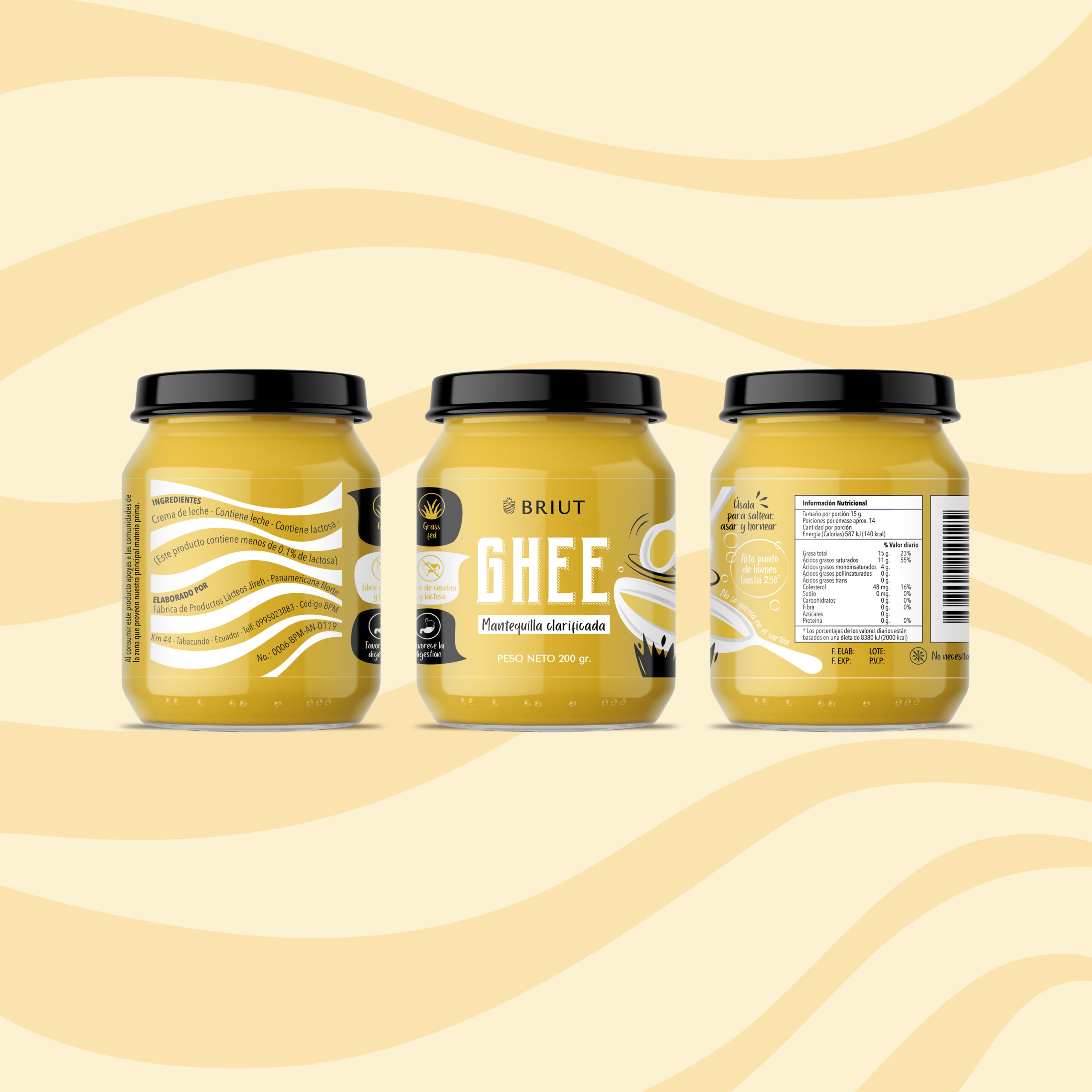
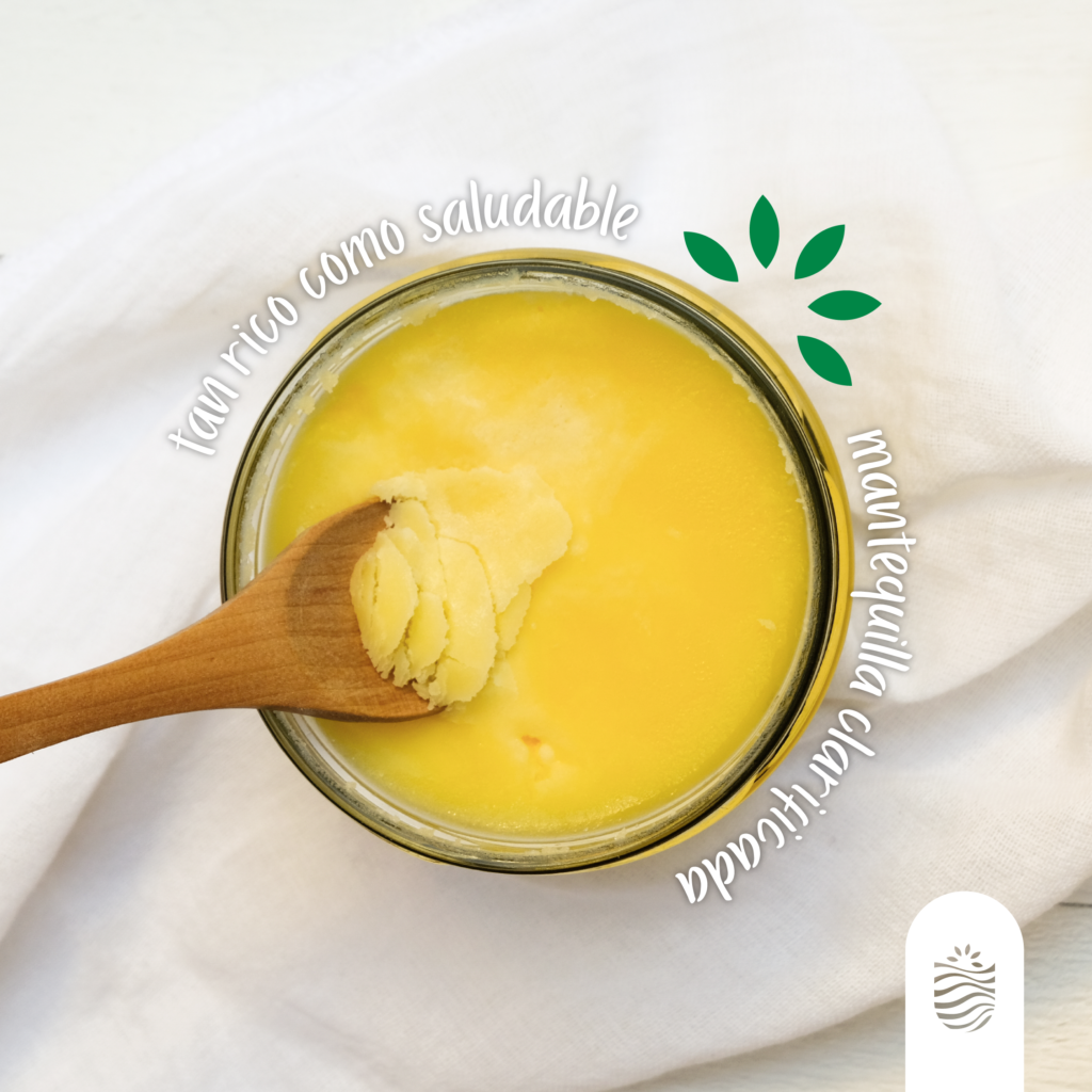
BRIUT is a brand of milk products with a healthy and natural approach. Its name comes from the Hebrew «Bro» which means to create. With BRIUT, you can create and maintain your health from a good diet
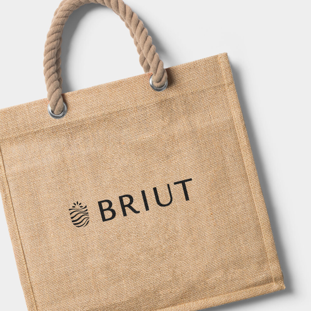
For the development of the brand identity, we start from their most important pillars: health, green and natural life. For the symbol, we took the letter «U» incorporating the sun and the fields with wavy shapes representing products derived from milk.
